September 17, 2026 · 3 min read
Link in Bio Button Text: 20 Clear Examples for Creators
Give every bio link a clear purpose with 20 button text examples for videos, product picks, newsletters, and inquiries, plus a simple editing checklist.
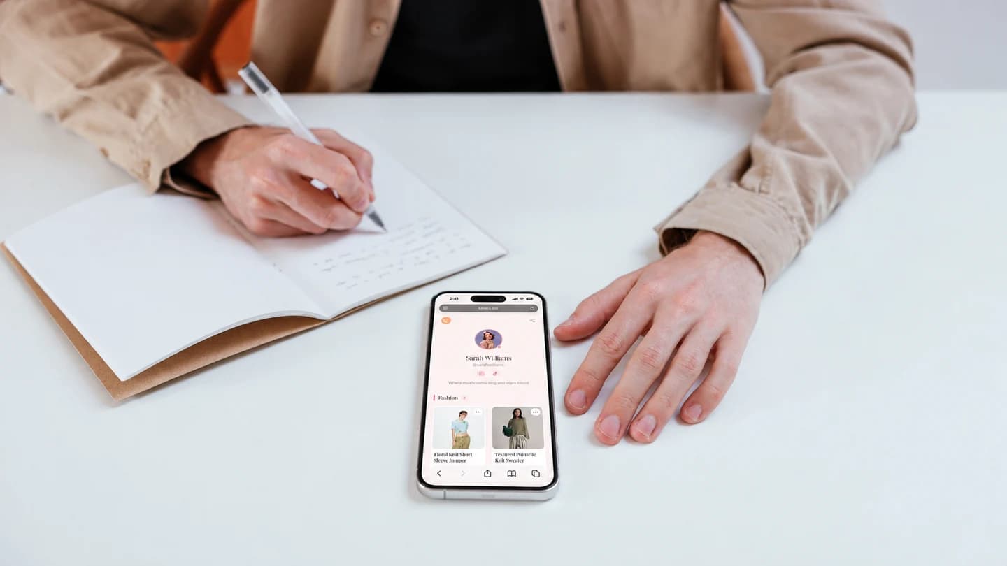
Your latest post tells followers to visit the link in your bio. They arrive and see three buttons: “Click here,” “Discover,” and “More.” Which one leads to the thing you just mentioned?
Clear link in bio button text answers that question before someone taps. Treat each label as a small promise about the destination: what visitors will find and what they can do there.
The examples below are starting points for your own writing. Adapt them to the actual page you are linking to, rather than using a label that promises more than the destination delivers.
For videos and other content
Name the content or its subject instead of relying on “Latest post.” Someone arriving from an older video may have a different idea of what “latest” means.
- Watch my small apartment tour
- Read the weekend packing guide
- Listen to the latest podcast episode
- See the full desk makeover
- Browse my beginner photography tutorials
Choose a specific title when the link opens one piece of content. Use a collection label when the destination contains several pieces. “Watch my apartment tour” should open the tour, while “Browse my home videos” can lead to a video library.
For product recommendations
Give visitors a clue that connects the link to your post. “Shop my favorites” may work as a general category, but it does not identify the shoes or travel pouch someone came to find.
- Find the outfit from my latest reel
- Browse my carry-on essentials
- See the camera gear I use
- Explore my small-space storage picks
- Find the products in my desk setup
Use personal claims only when they are true. “The camera gear I use” implies firsthand use; “Camera options on my wishlist” communicates something different. Keep the wording accurate as your recommendations change.
If your product list needs structure first, start with our guide to organizing affiliate links.
For newsletters and resources
Tell readers what they are signing up for or downloading. If the destination asks for an email address before providing a resource, make that step clear in the surrounding description.
- Join my weekly studio newsletter
- Get the printable packing checklist
- Read a sample newsletter
- Download the desk planning worksheet
- Sign up for new tutorial updates
Avoid adding “free” automatically. Check the destination and any conditions first. Likewise, only promise a weekly newsletter if that is the schedule you intend to maintain.
For inquiries and creative work
Different visitors may need different contact routes. A potential client looking for your portfolio has a different task from a brand requesting your media kit.
- View my design portfolio
- Ask about an illustration commission
- Send a brand collaboration inquiry
- View my media kit
- Check workshop dates and details
Match the action to the destination. If the next page is an inquiry form, “Ask about a commission” is more precise than “Book now.” Save booking language for a destination where visitors can actually make a booking.
Edit your labels in three passes
First, check the promise. Open each link and compare the destination with its label. Fix anything that leads to outdated content or requires an unexpected step.
Next, remove vague words. Replace “Here,” “This,” and “More” with a useful subject. Keep enough detail to distinguish similar links without turning each button into a paragraph.
Finally, preview on a phone. Look for awkward wrapping and several labels that begin identically. Ask someone to find one specific destination without explaining the page to them.
Start with the three links people are most likely to need after your current post. Give those links clear names, then review the rest of the page using the same approach.